neat
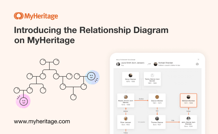

When you add people to your family tree, their relationships to you are calculated automatically. That relationship is then shown anywhere on the MyHeritage site where the names of your site members and people in your tree appear. In the past, you would see the relationship listed for that individual written out — such as a third cousin once removed, or a second cousin’s husband — but it was often difficult to visualize more complex relationships when you aren’t very familiar with all the people connecting you to this relative.
With the recent release of the improved family tree on MyHeritage, we introduced a new relationship diagram that enables you to visualize your relationship to other people in the family tree and easily understand how you are related. The relationship diagram is accessible from the left-hand details panel in the family tree.
The newly updated family tree, and in particular the new relationship diagram, have received high praise from our users since their release.
Lynn Cremona commented: “I love what I see so far, especially the relationship diagram. I can see how much easier it is going to be to navigate around the tree. Thank you!”
Patricia Peoples wrote: “Wow! I am blown away with so many of these improvements but perhaps my favorite is the new relationship diagram! I’ve had to put that together myself for so long and now you’re doing it for me — amazing!”
We are happy to announce that the diagram has now been added to other locations throughout the family site, such as the Discoveries and Photos pages. The diagram is especially useful for very large trees, where you have many people to keep track of. It can also be helpful when relatives that you don’t know have been added to the family tree by other site members. For example, your cousins may have added a new photo and tagged people in the family tree that you don’t recognize. You can now simply click on the relationship to understand where they fit into your family tree.
We have also made a number of changes to the new tree in response to the feedback we’ve received from users. We’ll elaborate on that below.
Here’s how to find the relationship diagram in its new locations:
Discoveries section
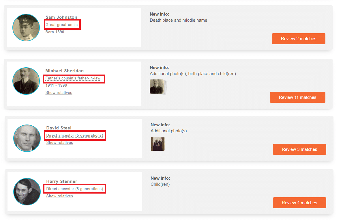
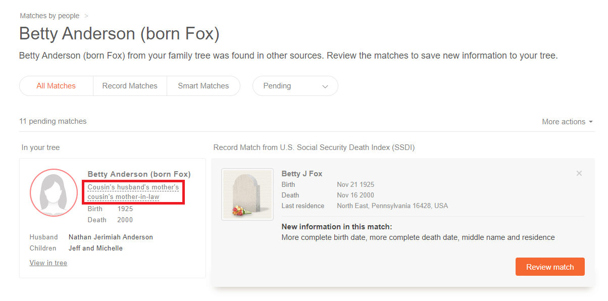
Under the Discoveries tab, every time the name of a person who is in your tree appears along with their relationship to you, that relationship will now be clickable.
This includes the “Matches by people” page, which displays all the people in your family tree who have Smart Matches™ and/or Record Matches, and also the “Match by Source” page, which lists your Smart Matches™ and Record Matches according to their source.
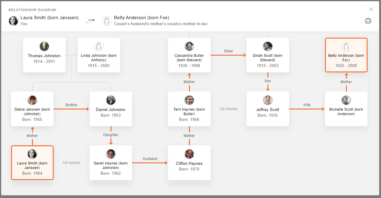
You’ll now be able to click on the relationship appearing under the name of anyone with a discovery to see how you are related using the new relationship diagram.
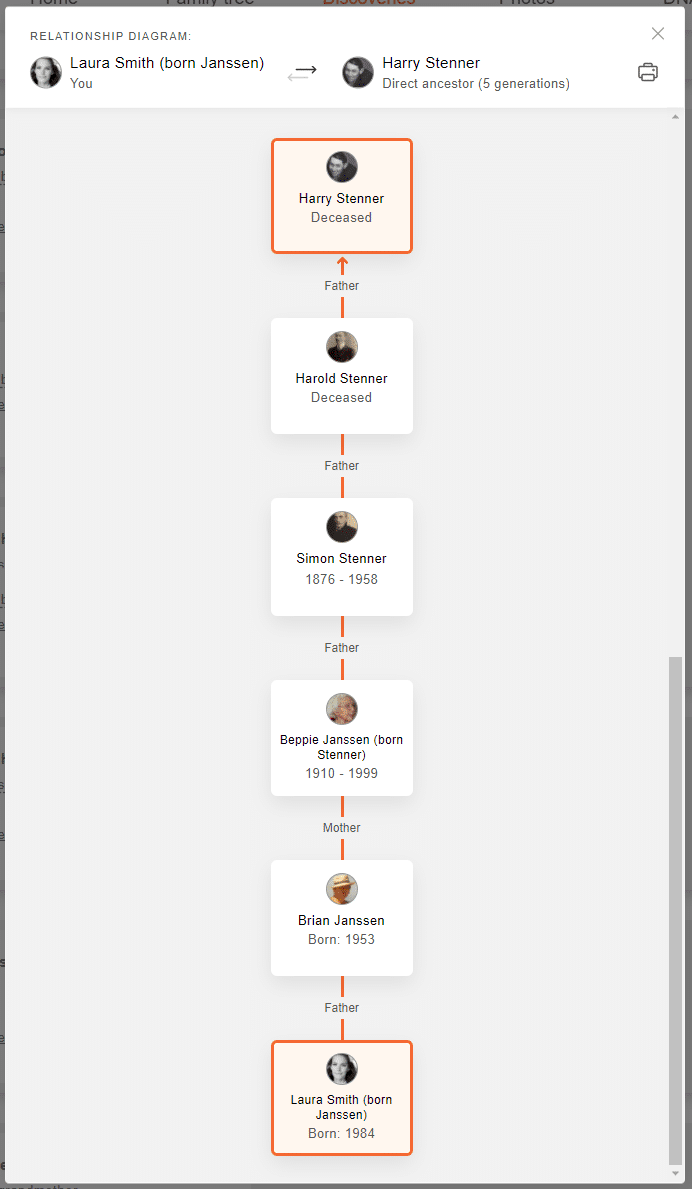
Harry Stenner is a direct ancestor, 5 generations up:
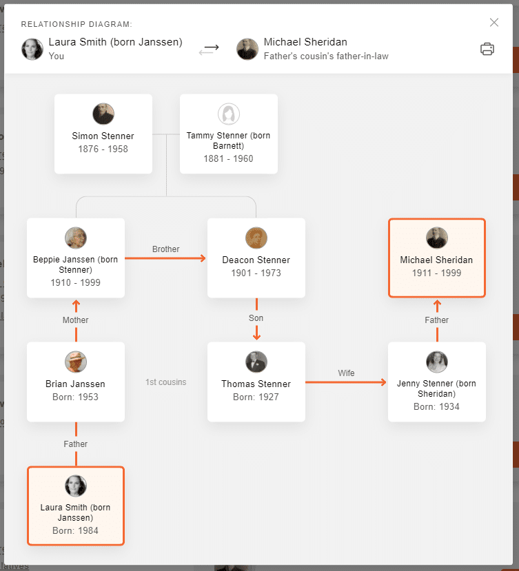
Michael Sheridan’s relationship is slightly more complex:
When you click on a specific match, or the Review match page, both will include the option to click on the relationship and see exactly how you are related.
Photos section
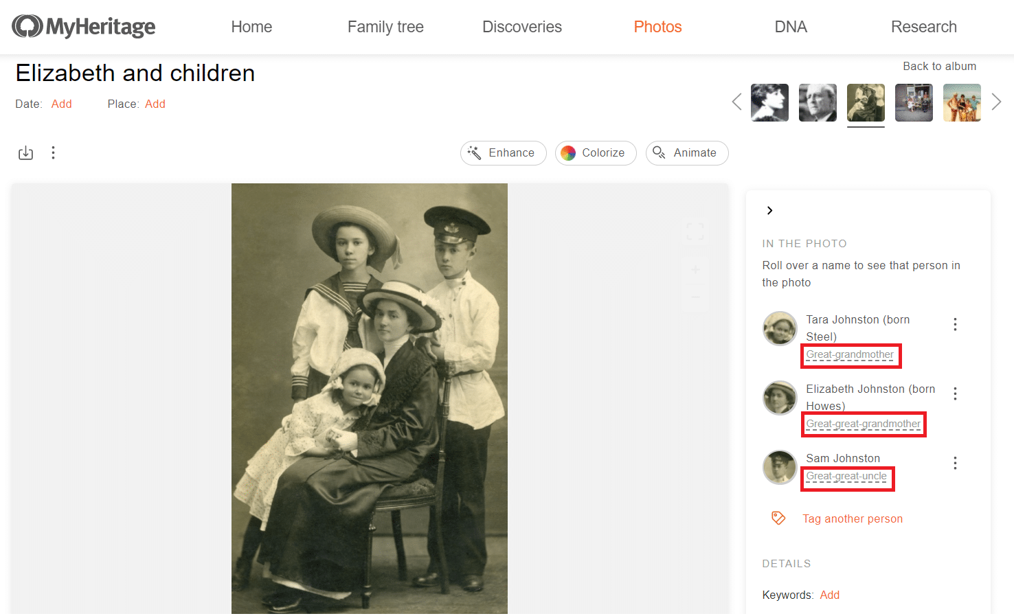
You can easily tag family members in photos you have uploaded to MyHeritage by clicking on their face in the photo, typing in their name, and selecting them from the drop-down list that appears. Then, whenever you view that photo, you’ll be able to identify the faces in the photo, and a list will appear on the right containing the names and profile photos of any family members you have tagged in this photo.
You can now click on the relationships underneath their names in order to see the relationship diagram showing how you are related to each of these relatives.
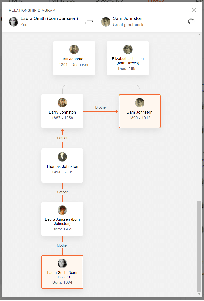
For example, clicking on the relationship “Great-great-uncle” for Sam Johnston will show you exactly how you are related:
Saving and printing the relationship diagram
You can also save or print the relationship diagram to your computer. This may be useful to keep in your files for future reference, or to bring along with you to family reunions or when interviewing family members.
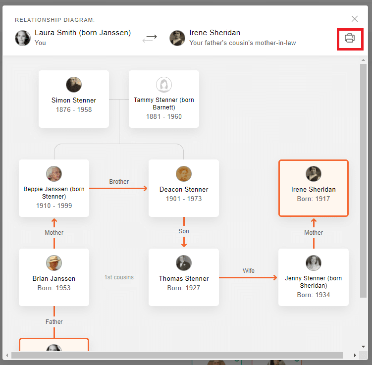
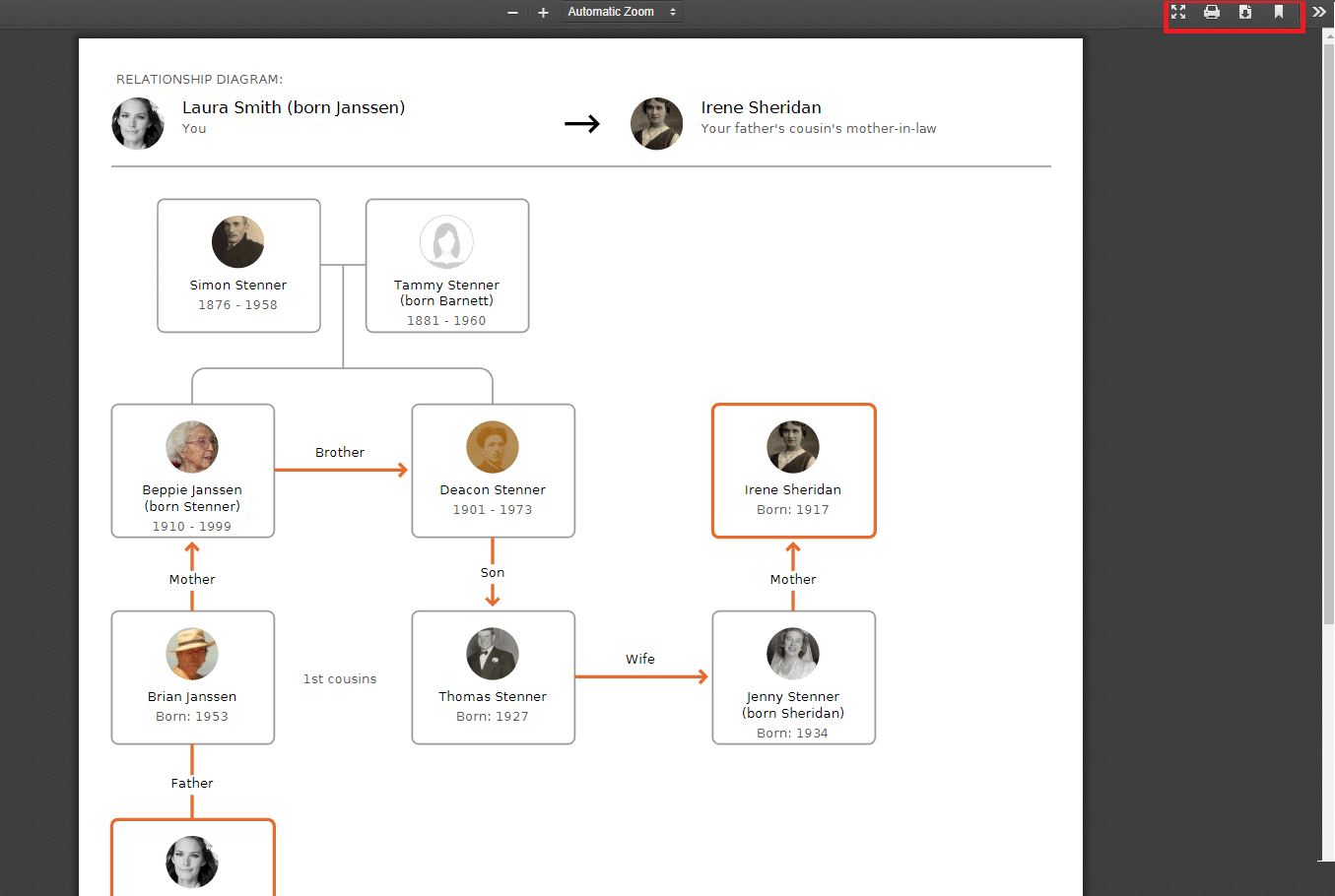
To save or print the diagram, click the printer icon on the upper right corner of a relationship diagram. This will open a PDF of the diagram in a new window.
There you can choose to save the PDF to your device or print it.
Large trees
Until recently, we calculated all relationships for trees with up to 5,000 people (and a limited set of relationships for trees with up to 17,000 people). Thanks to some recent optimizations, we were able to increase the limit to 10,000 (and 20,000 for partial calculations). We are working on further increasing the limits so that even larger trees will have all their relationships calculated.
Next steps
In the near future, we will also adapt the new relationship diagram for use under the older “Relationship report” feature, found under the “Family tree” tab in the navigation bar.
Updates to the family tree
Following the recent improvements that were made to the online family tree at MyHeritage, we received feedback from our users who missed certain aspects from the previous version of the family tree. We take this feedback very seriously and have brought back the following features accordingly:
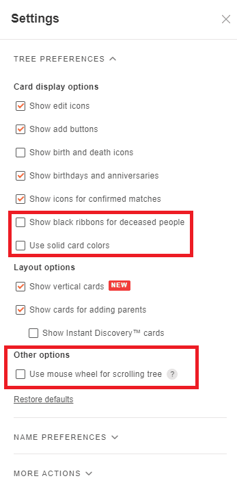
- The black ribbon: Many users preferred being able to distinguish between living and deceased individuals just by glancing at the family tree and seeing which profile cards had a black ribbon. Users can now choose to revert back to displaying black ribbons on the cards of deceased individuals in the family tree.
- Solid color backgrounds: Some users missed having the profile cards filled with solid colors, either pink or blue. This option has been returned for them.
- Using the mouse wheel to scroll through the tree: In the new version, by default, scrolling up or down on the mouse wheel (or two fingers on the trackpad) will zoom in or out on your tree. We have brought back the option of using the mouse wheel to scroll up or down through your tree instead, and to zoom in and out by scrolling while holding down the Ctrl key.
All of these options are off by default, but can be activated in the settings section by clicking the gear icon at the top right of the family tree:
 Conclusion
The new relationship diagram is a major improvement to the family tree and family site experience and allows you to better understand the context of the relatives that you are researching and learning more about.
We continue to listen to feedback and make using MyHeritage to build and expand your family tree an even better experience for our users.
Have a question about family relationships? Check out our latest article about Family relationships on the MyHeritage Wiki.



John Byrde
September 30, 2021
The recent improvements are proving very helpful, especially the Relationships Diagram where one can see relationships at a glance. I’m glad you are giving more leeway to users to personalize their tree’s look.
I would like to recommend improving the Help section, perhaps using a bit of AI. The Search function is not very helpful and seems to rely on exact matches of the Search request to a text. For example, I needed some basic information about using the syncing function and could not find anything relevant. However, when I requested help from the Help Team, I received a full explanation. If such explanations went into the Knowledge Base, any search on “syncing” (with a little AI help) would bring up a list of relevant texts, etc.
I would also like to suggest a more intense collaboration with other data sources, a wider range than than at present. Many data sources require a paid subscription. With my worldwide tree, this going to cost a fortune! I already pay the highest MyHeritage rate. Couldn’t you negotiate some sort of commercial agreement whereby MyHeritage subscribers get easier and cheaper access to other companies/country’s databases/records? To cover costs you could offer so many credit points with a MH subscription that could be topped up through further payments. Technically it’s quite straight forward…